The completion of a specialized residential renovation in Naples, Italy, has highlighted a growing intersection between clinical psychology and interior architecture. Designed by Ciro Scognamiglio and Francesca Sannino of the firm AreaDieci Architetti, the project serves as a primary residence for Elea and Armando, two medical professionals whose high-stress careers necessitated a living environment specifically engineered for psychological decompression. By utilizing color not as a decorative finish but as a fundamental architectural component, the designers have created a "technicolor daydream" that serves as a case study for the practical application of color theory in contemporary urban living.

The Architectural Mandate: Design for the Caregiver
The conceptual foundation of the Naples apartment was rooted in the specific lifestyle requirements of the homeowners. As doctors, Elea and Armando operate within the high-intensity, sterile, and often emotionally taxing environment of the healthcare system. Research in the field of Evidence-Based Design (EBD) suggests that individuals in high-stress occupations require domestic environments that provide a stark "sensory contrast" to their workplaces to prevent burnout and facilitate mental recovery.

"We spend our days taking care of others—we needed a space that would take care of us," Elea noted during the project’s unveiling. This requirement prompted AreaDieci Architetti to move away from the traditional "neutral box" approach typical of modern renovations. Instead, the firm developed a coherent design strategy where every vertical surface, piece of custom millwork, and furniture selection participated in a precise chromatic system. Architect Ciro Scognamiglio explained that the goal was to treat color as a structural element capable of defining volume and emotional resonance rather than a superficial layer of paint.

Chromatic Chronology: The Evolution of the Space
The project followed a rigorous timeline, beginning with a structural reassessment of the previously modern but unremarkable interior.

- Phase I: Conceptual Mapping (Months 1-2): The architects conducted interviews with the homeowners to identify psychological triggers. Cool tones were selected for their ability to evoke tranquility and perceived spaciousness, while warmer accents were reserved for areas intended for social interaction.
- Phase II: Structural Integration (Months 3-5): The installation of custom elements, including the dichroic glass window and integrated shelving, took place. This phase focused on ensuring that the "bones" of the apartment could support the heavy use of saturated color.
- Phase III: Curated Furnishing (Months 6-8): High-end Italian furniture pieces were selected to complement the architectural color blocks. This included sourcing iconic designs from Cassina and Miniforms that mirrored the apartment’s geometry.
- Phase IV: Final Calibration (Month 9): Lighting and surface finishes were adjusted to ensure the color palette remained effective under both natural and artificial light conditions.
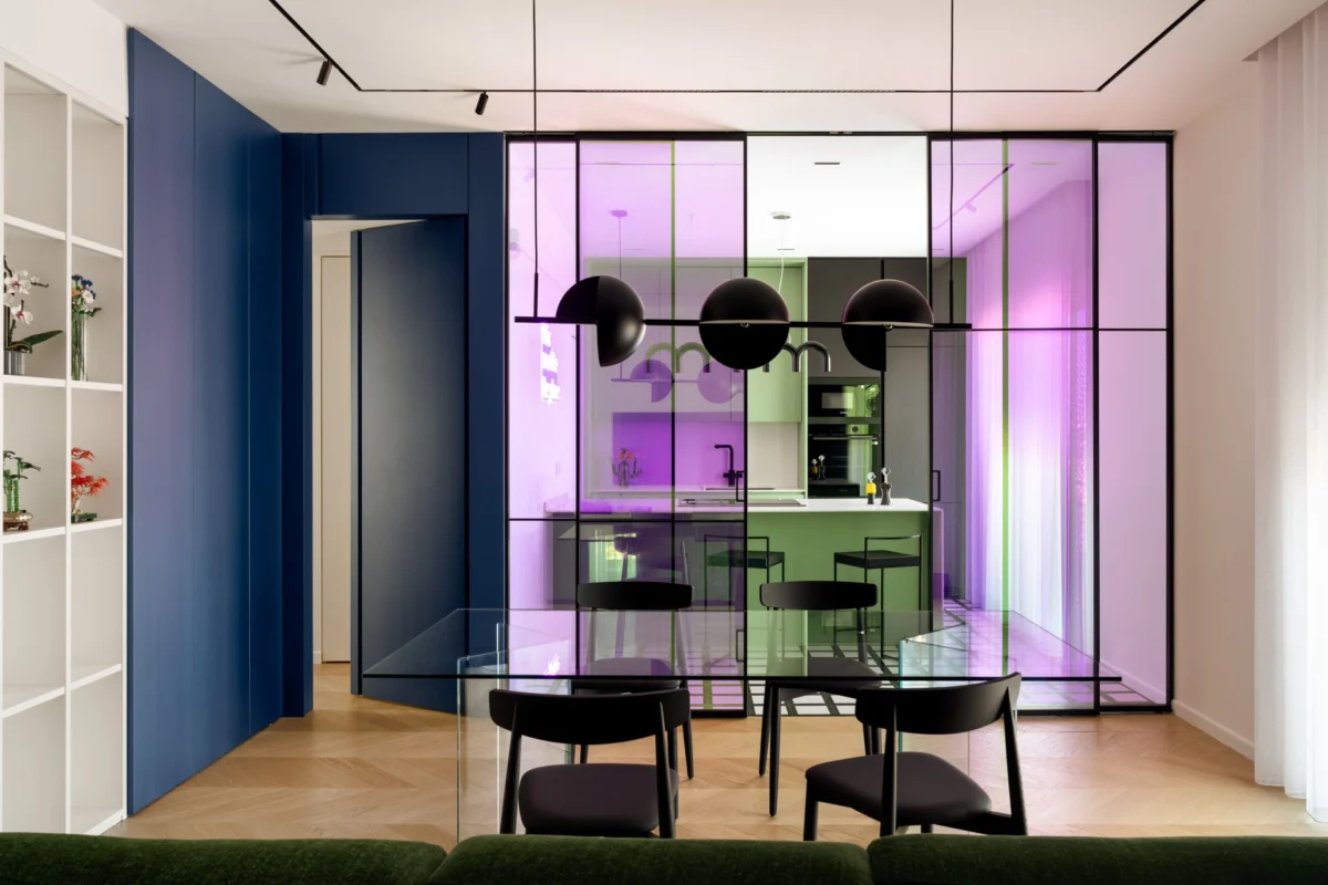
The Living Area: A Laboratory of Light and Refraction
The centerpiece of the public-facing area is a custom-designed dichroic glass window. Derived from the Greek word dikhroos (two-colored), dichroic glass is a material originally developed by NASA for use in satellite mirrors and spacesuit visors. In a residential context, it serves as a kinetic art piece. The glass refracts light differently depending on the angle of the sun and the observer’s position, casting a shifting spectrum of sapphire, amethyst, and gold across the room.

This iridescent effect ensures the living room is never static. The architects paired this high-tech element with grounding materials. The fireplace wall, for instance, is clad in "Sweet Bar" green ceramic tiles from Wow Ceramica, providing a tactile, earthy counterpoint to the ethereal glass. The furniture selection reinforces this dialogue between historical design and modern color theory:

- The Utrecht Armchair: Designed by Gerrit Thomas Rietveld in 1935 and produced by Cassina, this chair is rendered in a striking royal blue, providing a focal point of geometric stability.
- The Mex Cube Sofa: A Piero Lissoni design for Cassina, upholstered in a hue that matches the fireplace tiles, blurring the line between furniture and architecture.
- Soda Coffee Tables: Designed by Yiannis Ghikas for Miniforms, these tables are crafted from hand-blown Murano glass in shades of sapphire and amethyst, mimicking the transparency and color shifts of the dichroic window.
Private Quarters: Introspection and Therapeutic Aesthetics
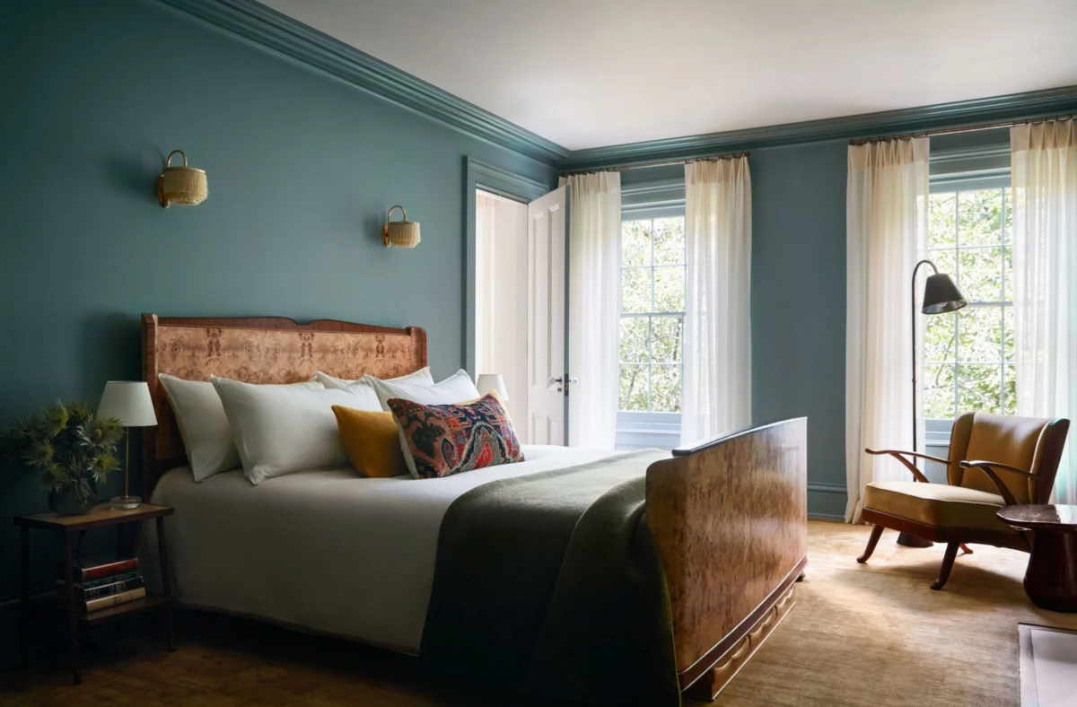
While the living areas are designed for social energy and dynamic light, the sleeping quarters transition into a more muted, therapeutic palette. The principal bedroom utilizes navy blue as its primary saturation point, a choice supported by psychological data suggesting that deep blues lower heart rates and prepare the brain for sleep.

The room features a "Banner" bed by Oggioni, set against a fantastical Glamora wallcovering that introduces subtle pastels and depth. The lighting is anchored by the "Parentesi" lamp, a 1971 classic by Achille Castiglioni and Pio Manzù for Flos, which allows for adjustable vertical illumination.

In the ensuite bathroom, the architects experimented with a "terracotta and acid green" dialogue. The walls feature acid green resin, while the surfaces are covered in "Brick Cotto" wall tiles by 41zero42. A freestanding "Portofino" bathtub by Karol serves as a literal and figurative invitation to slow down, positioned as a sculptural element within the space. The guest bathroom follows a more graphic approach, utilizing "Futura" glazed porcelain effect tiles by 41zero42 and "Rice Natural" irregular tiles by Marazzi for the backsplash.

Supporting Data: The Science of Color in the Home
The Naples project aligns with a growing body of scientific literature regarding "Neuro-architecture." According to a 2022 study published in the Journal of Environmental Psychology, environmental factors—including color saturation and light temperature—can account for up to a 15% variance in a resident’s self-reported stress levels.

- Blue Tones: Studies from the University of British Columbia indicate that blue environments enhance performance on tasks requiring creativity and are perceived as "trustworthy" and "calming."
- Green Tones: Research suggests that green, particularly sage and forest hues, reduces eye strain and is the color most easily processed by the human retina, making it ideal for recovery zones.
- Natural Materials: The use of oak parquet throughout the Naples apartment provides a "biophilic" base. Biophilia—the human tendency to seek connections with nature—has been shown to lower cortisol levels in urban inhabitants.
Broader Impact and Industry Implications
The collaboration between AreaDieci Architetti and their medical clients represents a shift in the luxury residential market. There is an increasing demand for "Wellness Real Estate," a sector that was valued at approximately $275 billion globally in 2021 and is projected to grow significantly through 2030.

Industry analysts suggest that the "Naples Model"—treating color as a psychological tool rather than a trend-based aesthetic—will likely influence future multi-family and single-family developments. By moving away from the "gray-scale minimalism" that dominated the 2010s, architects are rediscovering the ability of saturated environments to provide emotional support.

The project also highlights the resilience of Italian craftsmanship. From the Murano glass of the Miniforms tables to the specialized ceramics from Marazzi and Wow Ceramica, the apartment serves as a showroom for the "Made in Italy" label, proving that traditional manufacturing can adapt to high-concept, modern psychological requirements.

Conclusion: A Paradigm Shift in Domestic Design
For Elea and Armando, the apartment is more than a residence; it is a vital component of their professional sustainability. The architects have successfully demonstrated that when color is integrated into the architectural plan, it functions as a sensory orientation system. It can reassure the inhabitant, surprise the guest, and provide a necessary sanctuary from the external world.

The project concludes with a powerful architectural lesson: the domestic environment is not merely a place of shelter, but a psychological instrument. As the boundaries between work and life continue to blur for high-level professionals, the strategic use of color and light, as seen in this Naples renovation, offers a blueprint for the future of healthy, restorative living. The doctors’ credit this joyful interior for creating the balance and energy that defines their days, suggesting that the "technicolor" approach is not just a stylistic choice, but a medical necessity for the modern age.